Felis - Product Landing Wordpress Theme - v1.0
The Documentation
- Created: July 28th 2017
- Latest Update: July 28th 2017
- By: CactusThemes
- http://themeforest.net/user/cactusthemes
- Email: [email protected]
For support please checkout CACTUSTHEME SUPPORT FORUM
Felis Layout

Install and Update
Install Theme and Plugins
Always remember to download the latest version from your ThemeForest account. The Installable Wordpress Themes is just the installable Wordpress theme files. The Main Files includes these following files and folders:
- Documentation Folder - contains this document and other materials
- Installation Files Folder - contains all installable files, including theme & plugins
- theme/felis.zip - Felis theme
- plugins/felis-shortcodes.zip - A plugin which contains all shortcodes for theme. It contains Visual Composer plugin which helps you visually build pages
- plugins/cactus-faq.zip - A plugin which enables FAQ feature for theme
- plugins/cactus-unyson-backup-restore.zip - A plugin which enables import sample data fro theme
- plugins/js_composer.zip - Drag and drop page builder for WordPress. Take full control over your WordPress site, build any layout you can imagine – no programming knowledge required
- plugins/revslider.zip - The amazing (premium) Revolution Slider which creates beautiful image sliders for your website.
- Sample Data Folder - contains sample data files
- Felis-data.xml All Data
- Felis-themeoptions-settings.txt Theme Options Settings
- Felis Home-1.zip Sampple Revolution Slider
- Felis Home-2.zip Sampple Revolution Slider
- Felis Home-3.zip Sampple Revolution Slider
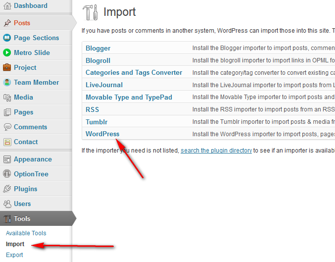
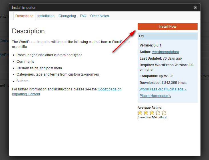
- Step 1. Log into your WordPress Admin area.
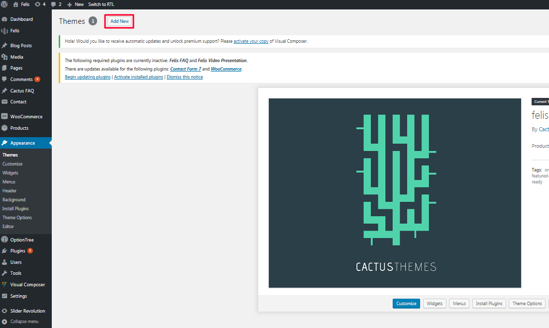
- Step 2. Look down the left hand column for “Appearance” and then click on the word “Themes”.

- Step 3. In the "Themes" page, click “Add News”
- Step 4. In the "Install Themes" page, click "Upload", then click “Browse” to browse for the theme installation file in [path-to-your-downloaded-package]/Installation File/Felis.zip). Click "Install Now".
- Step 5. After installed successfully, click "Activate" to make the theme active
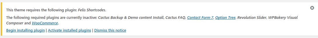
- Step 6. Install optional plugins if needed. The four included plugins are optional, but we recommend to install at least Felis Shortcodes and Felis Movie plugin to have full features. Navigate to Plugins > Add New to install and activate plugins. Besides, we recommend using these extra plugins (free). All has been tested and used on our demo page
- WooCommerce - An e-commerce plugin that helps you sell anything.
- Contact Form 7 - Simple but flexible contact form plugin
- OptionTree - Theme Options UI Builder for WordPress. A simple way to create & save Theme Options and Meta Boxes for free or premium themes.
Step 1. Use your FTP software to browse to “wp-content/themes” folder to install theme
Step 2. Extract the installation files to their corresponding folders, for example “felis.zip“ to “felis“ and upload to server
Step 3. Once it’s uploaded, go to your WordPress Admin, browse to “Appearance > Themes“
Step 4. Click “Activate“ to make the theme active
Auto Update
- Go to Plugins > Add News > Upload, find and install /plugins/envato-wordpress-toolkit.zip file (in the download package)
- To establish an Envato Marketplace API connection navigate to the Envato Toolkit page and insert your Marketplace username and secret API key in the designated input fields. To obtain your API Key, visit your "My Settings" page on any of the Envato Marketplaces
- Once the API connection has been established you will see a list of themes that can be auto installed. If you don't see any themes and are certain you've done everything correct, there is a good chance the theme author has not updated their theme to be available for auto install and update. If that's the case, please contact the theme author and ask them to update their theme's information
- Note Only theme is updated. Related plugins must be updated manually. Please check release logs to see if you need to update plugins
Manual Update
- Deactivate current theme by going to Appearance > Themes and activate any other themes such as the default Wordpress 4.8's Twenty Seventeen.
- Delete older version by clicking on Delete link. Confirm to delete.
- Update and re-install new version.
Install Sample Data
One Click Install
Before starting, there are some notes worth checking:
- Make sure you have installed all recommended plugins before importing sample data

- It is better to install sample data on a fresh Wordpress installation. Therefore, you may want to reset your site to default settings. Install and use Wordpress Reset plugin to do that. After installed, go to Tools > Reset
- The import process may take several minutes due to large data and your server capacity. If your server setting "Max Execution Time" is too low, increase it (as your hosting provider). Please do not close the browser until it finishes. If it fails, you can run this process again until seeing the "Success Message". Demo Images are not installed due to some copyrighted licenses
- If you have to run the process more than once, menu items may be duplicated. Just go to Appearance > Menus and edit/delete Main Menu items
Follow these steps to import sample data:
- Step 1: To import sample data by one click, you need to install and activate the Cactus Unyson Backup Restore plugin. It’s is in Theme Package ->cactus-unyson-backup-restore.zip
-
Step 2: Go to Felis > Sample Data.
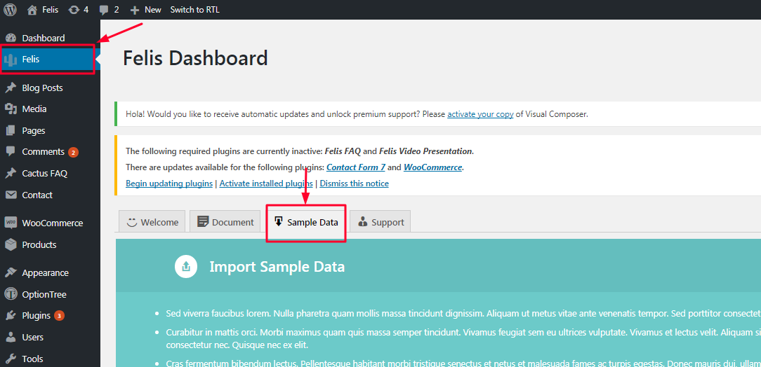 Image 4.1. Import sample data
 -
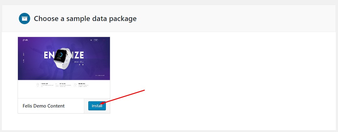
Step 3: Click Install button and confirm to install sample data. That’s all.
Image 4.2. Click Install button and confirm to install sample data
Traditional way to import
- Felis-data.xml All Data
- themeoptions-settings.txt Theme Options Settings
- revslider-home.zip Sample Revolution Slider
- widget_data.json Widget configuration
- Primary Menu
Image 5.1.1. Primary menu - Mobile Menu
 Image 5.1.2. Mobile menu
 - Go to Appearance > Menus
- In the Manage Locations area, under Main Navigation, select menu for Primary Menu, Mobile Menu. Click Save
-
Go to to Appearance > Menus
Click Create a new menu. Enter a menu's name and click Create Menu
-
Check the menu item in the boxes in the left column, click Add to Menu to add items to the menu and drag/drop to arrange them.
-
4. If you would like to use this menu in navigation, in the Manage Locations area, assign your newly created menu to Primary Menu, Secondary Menu or Footer Menu. Click Save
5. Click Save Menu and that is all
- Main Sidebar: Main Sidebar used by All pages
- Footer Sidebar Appear in Footer
- WooCommerce Sidebar Appear in Woocommerce Shop and single page
- Woo Single Sidebar Appear above the footer of WooCommerce single page
- Logo Image Upload your logo image
- Retina Logo Retina logo should be two time bigger than the custom logo. Retina Logo is optional, use this setting if you want to strictly support retina devices.
-
Body Container Set container for Body:
- Full-Width
- Container
- Boxed
- Page Background Set Page Background:
- Background Color
- Background Image
- Background Position
- Background Size
- Background Repeat
- Background Attachment
- Custom Colors Show Custom Colors
- Custom Colors ON to config Colors
- Link - Color Choose Color for Hyper Link
- Link - Hover Color Choose Hover Color for Hyper Link
- Footer Background Set custom Background for Footer
- Select color
- Background- repeat
- Background- attachment
- Background- position
- Background- size
- Background- image
- Footer- Heading color Choose color for heading, widget title on footer
- Footer- Text color Choose color for text on footer
- Customize Navigation Colors ON to config Naviagation Colors
- Navigation - Background Color Choose background color for the Navigation
- Navigation - Item Color Choose color for menu items on Navigation
- Navigation - Item Hover Color Choose hover color for menu items on Navigation
- Navigation - Item Hover Background Color Choose background hover color for menu items on Navigation
- Navigation - Background Color of Current Item Choose background hover color for menu items on Navigation
- Navigation - Text Color of Current Item Choose text color for current menu item
- Navigation - Background Color For Sub Menu Choose background color for sub menu of Navigation
- Navigation - Sub Menu Item Color Choose color for sub menu item of Navigation
- Navigation - Background Color For Sub Menu Choose background color for sub menu of Navigation
- Navigation - Sub Menu Item Hover Background Color Choose hover background color for sub menu item of Navigation
- Custom Google Fonts Load custom Google Fonts to be used in Typography shortcode or your own custom code.
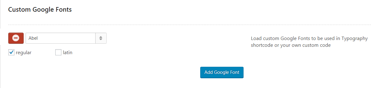 Image 7.3.1. Custom Google Fonts
 - Custom Font Settings ON to Customize default Font Settings
 Image 7.3.2. Custom Font Settings
- Use Google Font for Main Font If you use Google Font for Main Font Family, turn this on
- Main Font Family ( Use Goolge Font ) Choose Google Fonts for Main Font
- Main Font Family Enter name of font family here
- Main Font Size Choose Font Size. Default is 14px
- Main Font Weight Choose Font Weight. Default is normal
- Main Font Line Height Choose Font Line Height. Default is 1.7
- Use Google Font for Heading Font If you use Google Font for Heading Font Family, turn this on
- Heading Font Family ( Use Goolge Font ) Choose Google Fonts for Heading Font. Heading Font is used for all heading tags (ie. H1, H2, H3, H4, H5, H6). Enter name of font family here
- Heading Font Family Enter name of font family here. Heading Font is used for all heading tags (ie. H1, H2, H3, H4, H5, H6). Enter name of font family here
- H1 - Font Size Choose font size for H1. Default is 36px
- H1 - Line Height Choose font size for H1. Default is 1.1
- H1 - Font Weight Choose font size for H1. Default is 600
- H2 - Font Size Choose font size for H2. Default is 24px
- H2 - Line Height Choose font size for H2. Default is 1.1
- H2 - Font Weight Choose font size for H2. Default is 600
- H3 - Font Size Choose font size for H3. Default is 20px
- H3 - Line Height Choose font size for H3. Default is 1.1
- H3 - Font Weight Choose font size for H3. Default is 600
- H4 - Font Size Choose font size for H4. Default is 18px
- H4 - Line Height Choose font size for H4. Default is 1.1
- H4 - Font Weight Choose font size for H4. Default is 600
- H5 - Font Size Choose font size for H5. Default is 16px
- H5 - Line Height Choose font size for H5. Default is 1.1
- H5 - Font Weight Choose font size for H5. Default is 600
- H6 - Font Size Choose font size for H6. Default is 14px
- H6 - Line Height Choose font size for H6. Default is 1.1
- H6 - Font Weight Choose font size for H6. Default is 400
- Use Google Font for Main Navigation If you use Google Font for Main Navigation Items, turn this on
- Heading Font Family ( Use Goolge Font ) Choose font to be used for Main Navigation Items
- Heading Font Family Enter name of font family to be used for Main Navigation Items
- Main Navigation - Font Family Enter name of font family to be used for Main Navigation Items
- Main Navigation - Font Size Choose font size for Main Navigation Items. Default is 14px
- Main Navigation - Font Weight Choose font size for Main Navigation Items. Default is 14px
- Custom Font 1 Upload your own font and enter name "custom_font_1" in "Main Font Family or Special Font Family" setting above
- Custom Font 2 Upload your own font and enter name "custom_font_2" in "Main Font Family or Special Font Family" setting above
- Custom Font 3 Upload your own font and enter name "custom_font_3" in "Main Font Family, Heading Font Family or Meta Font Family" setting above
- Use Google Font for Main Font If you use Google Font for Main Font Family, turn this on
-
Header Style Choose Header style
- Style 1
- Style 2
-
Sticky Menu Enable/ Disable the Sticky Menu
- Disable
- Always sticky
- When page is scrolled up
- Background Color for Sticky Nav Choose Background Color
- Logo Image for Sticky Nav Upload your Logo Image used on Sticky Nav
- Blog Heading Set Heading Text for Blog
- Blog Subtitle Set Subtitle Text for Blog
-
Blog Sidebar Set Position of Blog Sidebar
- Leff
- Right
- Hidden
- Custom Excerpt LengthEnter number of excerpt length to display. Ex: 55. Default of WordPress is 55 words
- Reading More Text Enter text to display after more tag or the post does not have title. Ex: Continue Reading.
-
Single Post Sidebar Set Position of Single Post Sidebar
- Leff
- Right
- Hidden
- Author Enable About Author info
- Published Date Enable Published Date info
- Categories Show Categories info
- Tags Show Tags list
- Related Posts Show Related Posts
- Related Posts By Choose Related posts condition
- Category
- Tag
-
Single Page Sidebar Set Position of Single Page Sidebar
- Leff
- Right
- Hidden
- Enable Comments by default Enable Comment Panel under Single Pages
- Exclude Pages Exclude Pages from Search Results
- Head Title Tag Enter text of Title Tag (to be appeared on browser Tab Name)
- Page Featured Image Upload your Featured Image into 404 Page
- Page Title Title of the Page
- Page Content Enter Content of the 404 Page
- Social Left Panel Enable Social Panel on the Left
-
Social Text Schema Choose Text Color Schema of Social Left Panel
- Dark
- Light
- Social Position Choose Social Left Position
- Fixed
- Absolute
- Facebook Share Enable Facebook Share button
- Twitter Share Enable Twitter Share button
- LinkedIn Share Enable LinkedIn Share button
- Tumblr Share Enable Tumblr Share button
- Google+ Share Enable Google+ Share button
- Pinterest Share Enable Pinterest Share button
- Email Share Enable Email Share button
- SEO - Echo Meta Tags By default, felis generates its own SEO meta tags (for example: Facebook Meta Tags). If you are using another SEO plugin like YOAST or a Facebook plugin, you can turn off this option
- Lazyload Enable to use Image Lazyload
- Enable Smooth Scroll Effect Enable to use Smooth Scroll
- Mobile Animation Disable Animation on mobile to improve performance
- Turn On/Off loading FontAwesome If you don't use FontAwesome (a Font Icons library), you can turn it off to save bandwidth
- Turn On/Off loading Ionicons If you don't use Ionicons (a Font Icons library), you can turn it off to save bandwidth
- Turn On/Off loading CT-Icons If you don't use CT-Icons (a Font Icons library), you can turn it off to save bandwidth
- Custom CSS Enter custom CSS. Ex: .class{ font-size: 13px; }
- Facebook App ID (Optional) Enter your Facebook App ID. It is useful when you share your post on Facebook
- Enable Post Edit Link Show Post Edit Link from front-end for Editor
- Thumb 380x453px This thumb size is used for Woo Product Slider Shortcode
- Thumb 600x400px This thumb size is used for Blog Shortcode
- Thumb 600x400px This thumb size is used for Woo Category Shortcode
- Thumb 1012x500px This thumb size is used for Content Grid Shortcode
- Archives Page Title Enter Page Title of WooCommerce All Products page
- Archives Page Subtitle Enter Page Subtitle of WooCommerce All Products page
- Shop Sidebar Position Choose Sidebar Position for Shop and Single Product page
- Default
- Leff
- Right
- Hidden
- Posts Per Page Enter number of products per page in All Products page
- Product Single Style Choose Style for the product single page. Default is style 1
- Style 1
- Style 2
- Container- Select display container or not
- Padding- Enter number padding
- Margin- Enter number margin
- Gutter- Select show gutter or not by checking the textbox
- Background Color- Select color for background color
- Background Image- Select color for background image
- Parallax-Select display parallax or not
- Animation Effect- Select type of animation effect such as fade, fade-up, fade-dơn, fade-left, fade-right, flip-up,...
- Animation Delay- Enter numeber animation delay. Example: 100, 200, 300,...
- Animation Offset- Enter numeber animation offset. Example: 100, 300, 500,...
- Animation Duration- Enter numeber animation duration. Example: 400, 500, 600,...
- Animation Easing- Select type of animation easing as ease, linear, ease-in, ease-out,...
- 1.Typo
- 2.Block
- 3.Image
- 4.Icon Boxes
- 5.Info Box
- 6.Content Slider
- 7.Content Slider 2
- 8.Content Grid
- 9.Testimonials
- 10.Woo Product Slider
- 11.Woo Category Slider
- RESPONSIVE SETTINGS – This setting for the Felis Typo shortcode only.
- mobile_size – int: font size on mobile screen, in pixels. Example: 14px.
- mobile_line_height – int: line height on mobile screen, in pixels. Example: 26px.
- mobile_padding – mixed: padding on mobile screen. Format: TOP RIGHT BOTTOM LEFT. ex: 0px 0px 0px 0px.
- mobile_margin – mixed: padding on mobile screen. Format: TOP RIGHT BOTTOM LEFT. ex: 0px 0px 0px 0px.
-
Mobile_alignment – select: Text alignment on mobile screen.
- Default
- Left – align Left
- Right – align Right.
- Center – align Center.
- Size – int: Font size, in pixels. Example: 14px.
- Weight – Select: Font weight
- 200, 300, 400, 500, 600, 700, 800, 900, Bold , Bolder, Initial, Lighter, Normal.
- Style – Select: Font style.
- Inherit, Initial, Italic, Normal, Obilique.
- Spacing – String: Enter Letter Spacing value, including suffix. For example: “10px”.
-
Color style – Select: Style color of text.
- Default – Default color.
- Single – Single color.
- Gradient – Gradient color.
- Single color - Hexa color: Single color of text
- Gradient_from - Hexa color: Text gradient from color
- Gradient_to - Hexa color: Text gradient to color
- Padding – Mixed: Padding of text. Format: TOP RIGHT BOTTOM LEFT. ex: 0px 0px 0px 0px.
- margin – Mixed: Margin of text. Format: TOP RIGHT BOTTOM LEFT. ex: 0px 0px 0px 0px
- Alignment – Select: Text alignment (left, right, center)
- Line_height – Select: Text line height.
- 1em, 1.1em, 1.2em, 1.5em, 2em
- Border – Select: Type of border bottom.
- None
- Solid
- Dashed
- Dotted
- Double
- Groove
- Inset
- Outset
- Ridge
- Border_width – int: Set width of Border Bottom, in pixels. Default is 1px.
- Html_tag – string: HTML tag to wrap the text. Default is: div
- Content- Enter content text
- Line Top- Select display line top or not
- Disable
- Enable
- Font_family – String: Enter custom Font Family Name for this typo NOTE: You need to add the Custom Google Fonts you need in Theme Option > Custom Font before adding the font in this option.
- DESIGN OPTIONS.
- Alignment – select: Content alignment.
- Left – Align Left.
- Right – Align Right.
- Center – Align Center.
- Color_mask – select: Add default theme’s color mask below the content and above the background.
- on – Add Mask.
- off – No.
- DESIGN OPTIONS.
- ImageID - Enter image ID
- Image_size - string: Enter image size (Example: "thumbnail", "medium", "large", "full" or other sizes defined by theme). Alternatively enter size in pixels (Example: 200x100 (Width x Height)).
- Image_link - string: Enter URL if you want this image to have a link
- Hover_style – select: Image Hover Style.
- low – Glow
- color – Add Color
- fade-in – Fade In
- fade-out – Fade Out
- overlay-add – Add Overlay
- overlay-remove – Remove Overlay
- blur – Blur
- zoom – Zoom In
- Image_alignment – select: Image alignment.
- pull-left – Left
- pull-right – Right
- center-block – Center
- [felis_iconboxes] item_style – Select: Choose icon box style.
- 1 – Style 1.
- 2 – Style 2.
- 3 – Style 3.
- [felis_iconboxes] items_per_row – Select: Select Number of items per row.
- 1 – 1 item.
- 2 – 2 items.
- 3 – 3 items.
- 4 – 4 items.
- 6 – 6 items.
- [felis_iconboxes] DESIGN OPTIONS
- [felis_iconbox] title – text: Title of the box.
- [felis_iconbox] title_color – text: Title of the box.
- [felis_iconbox]Content- Enter content text
- [felis_iconbox] content_color – hexa color: Content color of the box.
- [felis_iconbox] icon – text: CSS Class name of icon, support Font Awesome (http://fontawesome.io/icons/), ionicons (http://ionicons.com/) and CT Icons(http://business-hub.cactusthemes.com/wp-content/themes/business-hub/css/fonts/ct-icon/icons-reference-class.html)
- [felis_iconbox] icon_color_style – Select: Icon style color of the box. Gradient style is used only for CT Icons Class
- [felis_iconbox]default - Default Color
- [felis_iconbox]single - Single Color
- [felis_iconbox]gradient - Gradient Color
- [felis_iconbox] icon_single_color – hexa color: Icon single color of the box.
- [felis_iconbox] icon_gradient_from – hexa color: Icon Gradient From Color.
- [felis_iconbox] icon_gradient_to – hexa color: Icon Gradient To Color.
- [felis_iconbox] main_color – Select: Main style color of the box.( Use for Style 2 )
- [felis_iconbox]default - Default Color
- [felis_iconbox]single - Single Color
- [felis_iconbox]gradient - Gradient Color
- [felis_iconbox] main_single_color – hexa color: Main single color for Style 2
- [felis_iconbox] main_gradient_from – hexa color: Main gradient from color for Style 2
- [felis_iconbox] main_gradient_to – hexa color: Main gradient to color for Style 2
- [felis_iconbox] box_url – URL: URL to navigate of the box
- box_style - Select : Choose icon box style.
- 1 - Style - 1
- 2 - Style - 2
- title - textfield : Title of Box.
- subtitle - textfield : Subtitle of Box.
- imageID - Enter Image ID
- image_align - select: Image Alignment
- left - Align Left
- right - Align Right
- Content- Enter content text
- conten_align - select: Content Alignment
- left - Align Left
- right - Align Right
- padding_bottom - textfield: Content Padding Bottom In pixels. Example: 30px
- [felis_content_slider] Item Style – Select: Choose icon box style.
- 1 – Style 1.
- 2 – Style 2.
- 3 – Style 3.
- [felis_content_slider] DESIGN OPTIONS
- [felis_content_slide] title – text: Title of slide.
- [felis_content_slide] subtitle– text: Subtitle of slide.
- [felis_content_slide]Content- Enter content of slider
- [felis_content_slide] imageID – Enter image ID of slide.
- [felis_content_slide] bg_image – Enter Background image ID of slide.
- [felis_content_slide] slide_url – text: URL to navigate
-
Data Source - Select type of data source
- Post
- Attachment
- Images- Enter Image ID
- count - text : Set max limit for items in slide or enter -1 to display all (limited to 1000).
- cats - autocomplete : Search for category name to get autocomplete suggestions.
- Ids - autocomplete : Search for post ID or post title to get autocomplete suggestions.
- item_rows - select: Select Number of rows to show
- 1 - 1 Row
- 2 - 2 Rows
- items_per_row - select: The width of item depends on the number of items per row based on 12 columns. For example, if you choose 4 items per row, the width of each item will be 3 columns. Especially, if you want the width of each items is 3 columns, you can choose four items, then you just need to put 3 items per row.
- 2 - 2 items
- 3 - 3 items
- 4 - 4 items
- 6 - 6 items
- autoplay - checkbox : Autoplay the slider or not.
- bullets - checkbox : Enable the slider bullets or not.
- bullets_align - select : Bullets Alignment.
- left - Align Left
- right - Align Right
- center - Align Center
- orderby - select : Select order type.
- date - Date
- ID - ID
- author - Author
- title - Title
- name - Name
- modified - Modifield
- parent - Parent
- rand - Random
- comment_count - Comment Count
- menu_order - Menu Order
- none - None
- order - select: Select sorting order.
- DESC - DESC
- ASC - ASC
Data Source- Select Type of Data source
- Post
- Attachment
- Images - Enter Image ID
- cats - autocomplete : Search for category name to get autocomplete suggestions.
- Ids - autocomplete : Search for post ID or post title to get autocomplete suggestions.
- orderby - select : Select order type.
- date - Date
- ID - ID
- author - Author
- title - Title
- name - Name
- modified - Modifield
- parent - Parent
- rand - Random
- comment_count - Comment Count
- menu_order - Menu Order
- none - None
- order - select: Select sorting order.
- DESC - DESC
- ASC - ASC
- [felis_testimonials] Item Style – Select: Choose testimonials style.
- 1 – Style 1.
- 2 – Style 2.
- [felis_testimonials] autoplay - select: Autoplay the testimonial slideshow or not
- 0 – Disable
- 1 – Enable
- [felis_testimonials] DESIGN OPTIONS
- [felis_testimonial] avatar – upload: Avatar image.
- [felis_testimonial] name – text: Name of person.
- [felis_testimonial] title – text: Title of person.
- [felis_testimonial] Content – Enter content text.
- [felis_testimonial] Number of Testimonial Item – Enter number of testimonial item.
- Slider Style - select : Choose layout style to show
- count - text : Set max limit for items slider or enter -1 to display all (limited to 1000).
- items_per_row - select: The width of item depends on the number of items per row based on 12 columns. For example, if you choose 4 items per row, the width of each item will be 3 columns. Especially, if you want the width of each items is 3 columns, you can choose four items, then you just need to put 3 items per row.
- 2 - 2 items
- 3 - 3 items
- 4 - 4 items
- 6 - 6 items
- autoplay - checkbox : Autoplay the slider or not.
- cats - autocomplete : Search for product category name to get autocomplete suggestions.
- posts - autocomplete : Search for product ID or product title to get autocomplete suggestions.
- orderby - select : Select order type.
- date - Date
- ID - ID
- author - Author
- title - Title
- name - Name
- modified - Modifield
- rand - Random
- comment_count - Comment Count
- menu_order - Menu Order
- none - None
- order - select: Select sorting order.
- DESC - DESC
- ASC - ASC
- count - text : Set max limit for items slider or enter -1 to display all (limited to 1000).
- items_per_row - select: The width of item depends on the number of items per row based on 12 columns. For example, if you choose 4 items per row, the width of each item will be 3 columns. Especially, if you want the width of each items is 3 columns, you can choose four items, then you just need to put 3 items per row.
- 2 - 2 items
- 3 - 3 items
- 4 - 4 items
- 6 - 6 items
- autoplay - checkbox : Autoplay the slider or not.
- Step 1. Create a page named Home Page (or whatever you like). Go to Pages > Add New.
- Step 2. Disable Comments on this page
- Step 3. Build content of home page using shortcodes and other elements
- Step 4. Go to Appearance > Theme Options > Front Page. In this tab, you set-up Header Style for Home Page Header and other conditions to query items for Header
- Step 5. Go to Settings > Reading and set Front page displays to A static page. Then set Front Page to the page you created in previous step (Home Page)
- Step 1. Create a page named Blog (or whatever you like)
- Step 2. Go to Settings > Reading and set Front page displays to A static page. Then set appropriate Posts Page to the page you created in previous step (Blog)
- Step 3. Go to Appearance > Theme Options > Blog to configure your blog page .
- Step 4. Go to Appearance > Widgets and drag widgets to Main Sidebar or Blog Sidebar if Blog Layout is set to Sidebar Left or Sidebar Right layout in previous step.
If there is any widget in Blog Sidebar, it will be used in stead of Main Sidebar -
Felis Post- widgets
- Title - Title of widget
- Number of posts - Number of posts to display
-
Choose how to query posts:
- Latest Posts
- Random Post
- Most Commented
-
Choose order of posts:
- ASC
- DESC
- Category - Category ID or Slug:
- Tags - Enter tag list
- Post IDs - If this param is used, other params are ignored
- In Admin Panel, choose Page, click "Add New" on top then enter your page title. You can custom slug of the page in Permalink field appeared after entering title.
- In Page Attributes box on the right side, choose your Parent page. It is set by default as no parent. Pages are usually ordered alphabetically, but you can choose your own order by entering a number in Order field.
- Also in Page Attributes box, choose your Page Template in dropdown list. See below Page Template list for more detail.
- Start editing your page content in the editing field. You can choose to edit your content using Visual or Text editor. To build content for you page you will need to our provided Shortcodes.
- Make other settings for the page in meta-boxes under editing field. Once you get your settings done, click Publish your page
- Page layout:
- Page Logo Image- upload your logo image of your page
- Body Container- Select "Default" to use settings in Theme Options
- Default
- Full-Width
- Container
- Boxed
- Page sidebar- Choose Sidebar Layout for Page
- Default
- Left
- Right
- Hidden
- Social left panel- Select on/off Social
- Social Position- Choose Social Position
- Fixed
- Absolute
- Social Text Schema- Choose Text Color Schema
- Dark
- Light
- Gutter- Select on/off Gutter
- Page Background- Set Page Background
- Select color
- Background- repeat
- Background- attachment
- Background- Position
- Background- size
- Backgrounf- image
- Page padding- Select turn on/ turn off Page padding
- Header settings:
- Header Layout- Choose header layout
- Default
- Style 1
- Style 2
- Header type- Choose type of Header content
- Use global setting
- Custom content
- Custom slider
- Hidden
- Breadcrumb- Choose turn on/ turn off Breadcrumb
- Page Heading Subtitle- Enter Page Heading Subtitle
- Header Layout- Choose header layout
- Footer settings:
- Footer Background- Set Footer Background
- Select color
- Background- repeat
- Background- attachment
- Background- Position
- Background- size
- Backgrounf- image
- Footer - Heading Color- Choose color for heading
- Footer - Text Color- Choose color for text on footer
- Footer - Link Color- Choose color for link on footer
- Footer - Link Hover Color- Choose color for link hover on footer
- Footer Background- Set Footer Background
- In your Admin Panel, go to Post and navigate to Add New.
- Enter your title and choose Post Format from Format box on the right side which shows different post format options: Standard, Audio and Video
- Add your post content in editing field. You can use our shortcode to build your content where needed.
- Add Categories for the post from the Categories box on the right side. You can add new category or choose from existing categories. Check the box to select Categories for your post. Add relevant Tags for your post in the Tags box, set Featured image on the right side and other setting from the sections below Editing field.
If you need detailed guide about post settings in WordPress, please find in WordPress Codex.
- Select any number of post options in the Post Options box
- All done, click Publish to publish your post
- Standard Settings: When selecting Standard Post, you will have Standard Settings post to add post content, featured image for your post.
- Audio Settings: When selecting Audio Post, you can add audio URL, and embedded video code for your post.
- Video Settings: When selecting Video Post, you can add video URL, and embedded video code for your post.
- Default Template Page will have the same layout which is set in Appearance > Theme Options > Single Page
- Step 1. Go to Product -> select "Category".
- Step 2. Enter your information as guide and Click on " Add new category" ".
- Step 1. Go to Product -> select "Add new".
- Step 2. Enter your information as guide and Click on "Publish ".
- CREATE A NEW Page FAQ
- Enter name title page
- The following, select type of template is FAQ page
- The end, Hit "Publish"
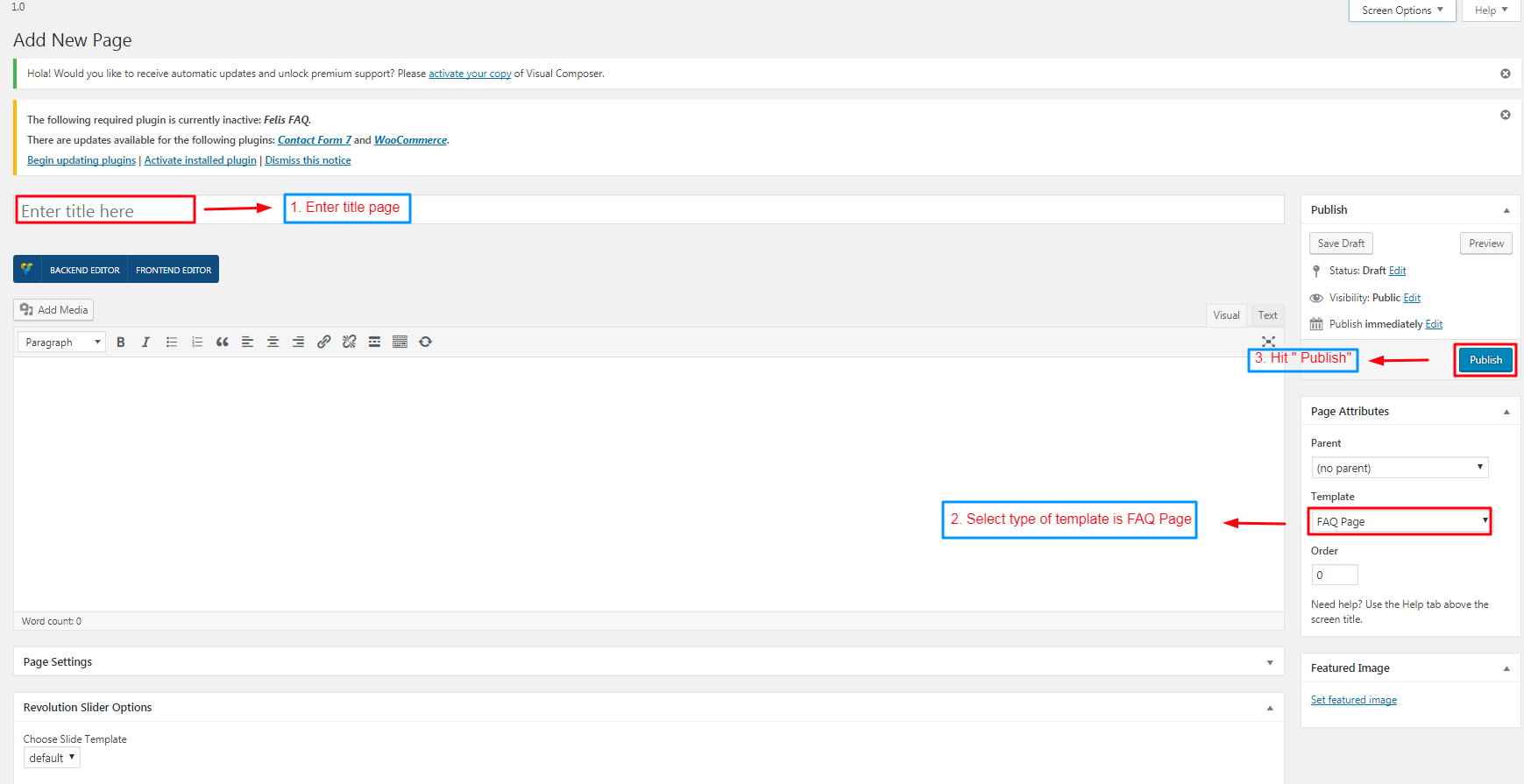 Image 13.2.1. Add a new page FAQ
 - Set up plugin Cactus FAQ
- After, Go to Cactus FQA -> Categories
- The next, Enter information as directed
- The end, Click "Add" New Category"
-
CREATE A NEW FAQ
- Go to Cactus FAQ -> Add new FAQ
- After, Enter information as directed
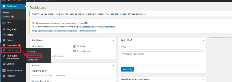 Image 13.2.4. Add a new FAQ
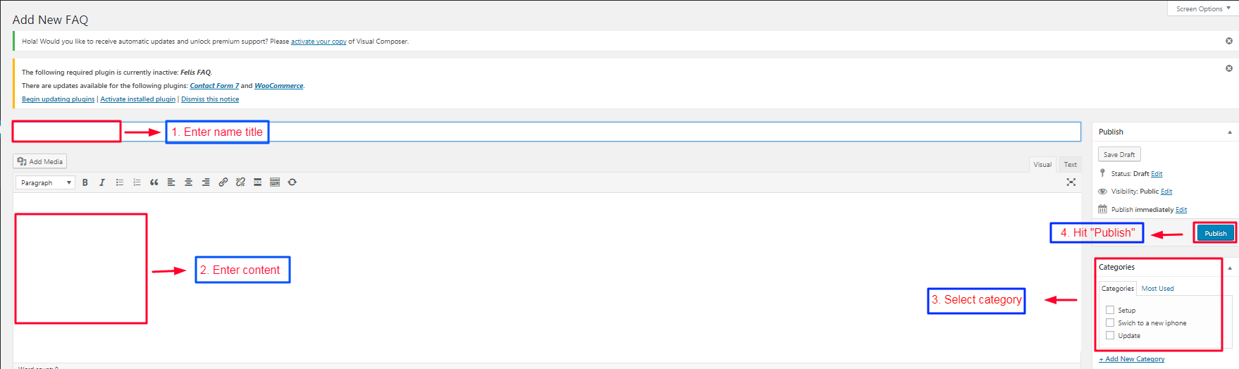 Image 13.2.5. Enter the information on a new FAQ
 - Set up plugin contact form 7
- Go to Contact -> Add new
- After, Create your form as option and Click "save"
- 1. Go to Pages -> All page -> Contact-> Click " Edit contact"
- 2.Click " Fonted editor"
- 3. Ater, Click " Add Element", then select " Contact form 7" and
- 4. The end, Select name of creating contact form and hit " Save changes"
- Download and install this tool POEdit
- Open POEdit and load [/Felis/languages/Felis.po]
- Translate the text and save the file
- A file named Felis.mo is created. Rename it with Code Name of your language. For example, de_DE.mo for German - Deutsche. See language code list here http://codex.wordpress.org/WordPress_in_Your_Language
- Open [{wordpress root}/wp_config.php] and find this line define('WPLANG', '');. Change it with your language code, for example define('WPLANG', 'de_DE');
- Revolution Slider (Extended License) - http://codecanyon.net/item/slider-revolution-responsive-wordpress-plugin/2751380
- Visual Composer (Extended License) - http://codecanyon.net/item/visual-composer-for-wordpress/242431
- Option Tree (GPL2 License) by Derek Herman - http://wp.envato.com
- BootStrap (Apache License v2.0) - http://twitter.github.io/bootstrap/
- Font Awesome (GPL License) by Dave Gandy - http://fontawesome.io
How To Create Menu
Existing Menu
Creating a New Menu
Sidebar
Felis supplies multiple sidebars so you may put your content to many positions.
Theme Options
There are settings for General, Custom Colors, Custom Fonts, Header, Footer, Blog Arichive, Single Post, Single Page,Search, 404, Advertising, Social Sharing,WooCommerce, and some settings in Misc. It is quite straight-forward to learn the use of these sections
General
Custom Colors
Custom Fonts
Header
Blog
Single Post
Single Page
Search
404
Social Sharing
Misc
WooCommerce
Shortcodes & Visual Composer
Design Options & Effect Options
Typo
DESCRIPTION:This shortcode is used to format text.
SCREENSHOT:
[felis_typo size="" weight="" style="" spacing="" color="" padding="" margin="" alignment="" line_height="" border="" border_width="" html_tag="" font_family=""] CONTENT [/felis_typo]
PARAMETERS::Block
DESCRIPTION:This shortcode is used to create a block to contain other non-block elements.
SCREENSHOT:Style align left
[felis_block alignment= "" color_mask=""]
PARAMETERS::Image
DESCRIPTION:This shortcode is used to create image with hover effect option and alignment.
SCREENSHOT:
[felis_image image="" image_size="" image_link="" hover_style="" image_alignment="" id=""]
PARAMETERS::Icon Boxes
SCREENSHOT:Style 1
[felis_iconboxes item_style= "" items_per_row= ""] [felis_iconbox title="" title_color="" content_color="" icon= "" icon_color_style="" icon_single_color="" icon_gradient_from="" icon_gradient_to="" main_color="" main_single_color="" main_gradient_from="" main_garident_to="" box_url="" item_aos="" item_aos_delay="" item_aos_offset=""] Content of icon box [/felis_iconbox] [/felis_iconboxes]
PARAMETERS:Info Box
SCREENSHOT:Style 1
[felis_info_box box_style="" title="" subtitle="" image="" content_align="" padding_bottom=""]
PARAMETERS:Content Slider
SCREENSHOT:Style 1
[felis_content_slider][felis_content_slide title="" subtitle="" image="" bg_image="" slide_url=""]Content[/felis_content_slide][/felis_content_slider]
PARAMETERS:Content Slider 2
SCREENSHOT:2 Rows
[felis_content_slider_2 items_per_row item_rows="" bullets="" bullets_align="" orderby="" order="" autoplay="" count="" cats="" posts=""]
PARAMETERS:Content Grid
SCREENSHOT:
[felis_content_grid orderby="" order="" count="" cats="" posts=""]
PARAMETERS:Testimonials
SCREENSHOT:Style 1
[felis_testimonials item_style="" autoplay=""] [felis_testimonial avatar="" name="" title=""] Quote content [/felis_testimonial] [/felis_testimonials]
PARAMETERS:Woo Product Slider
SCREENSHOTS Style 1
[felis_woo_product_slider layout="" count="" items_per_row="" autoplay="" orderby="" order="" product_cat="" product=""]
PARAMETERS
Woo Category Slider
SCREENSHOT
THE CODE
[felis_woo_category_slider count="" items_per_row="" autoplay=""]
PARAMETERS
Setting HomePage & Blog
If you do not see Discussion box, click on Screen Options grips on top of page and check Discussion
To set up blog, follow the steps below
Widgets
Pages & Posts
CREATE A NEW PAGE
Please follow these steps to create your pages:
PAGE SETTINGS
There are several settings to configure for any page:
POSTS
Create A New Post
Please follow these steps to create a new post:
POST FORMAT
Business-Hub theme supports Standard, Audio and Video Post Format. Each post format has several layout options
Page Attributes
Choose Page Template for this Page. There are 4 templates available
Product
CREATE A NEW CATEGORY PRODUCT
CREATE A NEW PRODUCT
Other Features
Breadcrumb / Pathway
FAQ
Contact form 7
CREATE A NEW CONTACT FORM
Translation & RTL
Licenses
Used Assets
The list might not be complete by accident. Authors who think you owe a license in this theme, please contact us at [email protected]
Support
If you face problems with the installation or customization of our product please do not hesitate to contact us via our support ticket system: